

Cream Color: Everything to Know About the Color Cream
- The Finest Writer

- Apr 12, 2025
- 6 min read

Welcome to our comprehensive guide on the soft and timeless color cream! This article will take you on a journey through the subtle and elegant world of cream, exploring its origins, meaning, symbolism, and diverse applications.
Known for its warm and neutral tone, the cream has a classic appeal that has captivated the hearts of artists, designers, and enthusiasts' hearts.
Join us as we delve into the depths of cream, unraveling its secrets and uncovering its significance in various aspects of our lives. Whether you're seeking inspiration for your next creative project or simply curious about this gentle hue, this article is your ultimate resource to unlock everything there is to know about the color cream.
What Color is Cream?

Cream is a light, warm, off-white color that sits in the spectrum between white and yellow. It is often described as a pale, soft, or milky hue with a subtle warmth that gives it a gentle and soothing appearance. Cream is known for its versatility and ability to blend seamlessly with other colors, making it a popular choice in fashion, interior design, and art. It combines white's purity with yellow's warmth, creating a harmonious shade that stands out for its elegance and simplicity.
How to Make Cream?
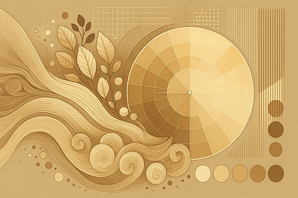
You can use different color models, such as RGB, CMYK, and HEX, to create the color cream.
Here are the values and codes for cream in various formats:
Cream RGB Values
Red: 255
Green: 253
Blue: 208
Cream HEX Color Code
The HEX code for cream is #FFFDD0.
Cream CMYK Code
Cyan: 0%
Magenta: 1%
Yellow: 18%
Black: 0%
Cream Web Safe Color
In the web-safe color palette, the closest approximation for cream is #FFFFCC.
Paint Mixing to Create Cream
If you want to create a cream with physical paint, you can start with a base of white and add small amounts of yellow until you achieve the desired cream shade. You can also mix in a tiny bit of brown or beige for added depth and warmth. Experimenting with different proportions will help you achieve the precise hue you want.
Cream Light and Perception
Cream results from how our eyes perceive specific wavelengths of light. It falls between white and yellow on the visible spectrum and can vary in appearance depending on lighting conditions and surrounding colors.
Cream is a versatile, neutral color used in various design, fashion, and artistic applications. Whether designing a website, painting a room, or creating artwork, these color values and codes will help you incorporate the soothing essence of cream into your projects.
What Colors Match Cream?
Cream is a versatile color that can be paired with several complementary and harmonious colors to create visually appealing combinations. Here are some color schemes that work well with cream:
Cream and White
The combination of cream and white creates a clean and elegant look. White provides a bright backdrop that allows the cream to stand out, adding a sense of balance and sophistication to the palette.
Cream and Gold
Cream paired with gold evokes a sense of luxury and opulence. The warm metallic tones of gold complement the softness of cream, resulting in a refined and elegant color scheme.
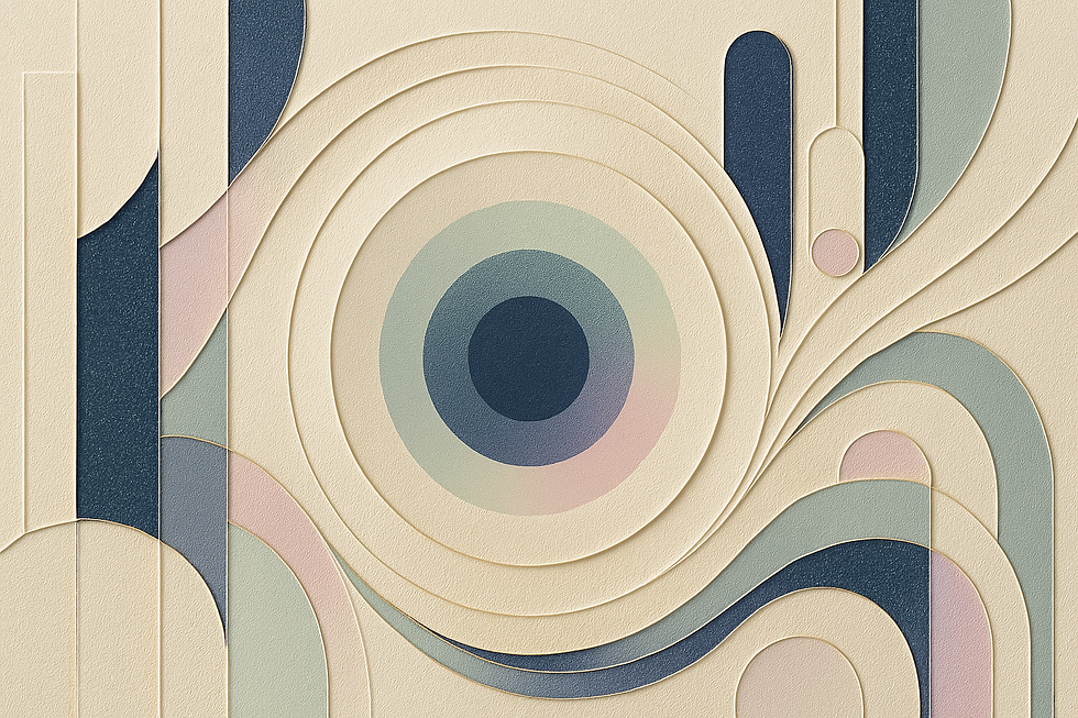
Cream and Navy Blue
The combination of cream and navy blue creates a classic and timeless color scheme. The deep tones of navy blue contrast with the lightness of cream, resulting in a balanced and sophisticated palette.
Cream and Gray
Cream and gray form a modern and understated duo. The cool tones of gray complement the warmth of cream, creating a sleek and contemporary color scheme.
Cream and Pastels
Combining cream with pastel colors such as mint green, blush pink, or lavender creates a soft and romantic palette. The subtle tones of pastels enhance the gentle nature of the cream, resulting in a harmonious and delicate color scheme.
These are just a few examples of colors that work well with cream. Don't be afraid to experiment and explore combinations to find the perfect match for your project or personal style.
What is Cream’s Complementary Color?

The complementary color of cream is a soft, muted blue or a pale, cool gray. In the traditional color wheel, cream, a combination of white and yellow, sits opposite the cooler tones of blue and gray. When cream and a soft blue or gray are placed together, they create a visually pleasing combination that exudes calmness and balance.
What Colors Are Similar to Cream?

Colors similar to cream can be found within the neutral and pastel spectrum. Here are some colors that share similarities with cream:
Ivory: Ivory is a light, off-white shade that closely resembles cream but with a slightly more yellow tone. It shares the same softness and warmth as cream, making it a great alternative.
Beige: Beige is another color similar to cream. It is a pale, sandy color with a subtle warmth that leans slightly toward brown. Beige carries the same neutral and soothing qualities as cream.
Ecru: Ecru is a light, grayish-beige color similar to cream but more muted and earthy. It shares the same versatility and elegance as cream.
Vanilla: Vanilla is a pale, yellowish-white color similar to cream but with a slightly warmer and richer tone. It retains the same soft and inviting qualities as cream.
Light Taupe: Light taupe is a pale, grayish-brown color similar to cream but with a more subdued and earthy tone. It carries the same warmth and neutrality as cream.
These colors are closely related to cream and can be combined or as alternatives to create a harmonious color palette.
What Does Cream Symbolize?

Cream symbolizes various meanings and conveys different emotions depending on the context. Here are some common symbolisms associated with cream:
Elegance and Sophistication: Cream is often associated with elegance and sophistication. Its soft and refined appearance conveys a sense of timeless beauty and grace, making it a popular choice in fashion, interior design, and branding.
Warmth and Comfort: Cream is also linked to warmth and comfort. Its gentle and soothing tones evoke feelings of coziness and relaxation, and they are often used in home decor and fashion to create a welcoming atmosphere.
Simplicity and Minimalism: Cream is a color of simplicity and minimalism. Its neutral and understated appearance conveys a sense of calm, balance, and purity without being overwhelming.
Neutrality and Versatility: Cream is often associated with neutrality and versatility. Its ability to blend seamlessly with other colors makes it popular for various design applications, from interiors to fashion.
Tradition and Timelessness: Cream is a color that exudes tradition and timelessness. Its classic and elegant appearance adds a touch of refinement to various contexts, from traditional to contemporary designs.
Softness and Gentleness: Cream is often linked to softness and gentleness. Its warm and delicate tones evoke care, tenderness, and nurturing, usually associated with comfort and ease.
It's important to note that color symbolism can vary across cultures and personal interpretations. The meanings associated with cream can be influenced by personal experiences, cultural beliefs, and the specific context in which it is used.
The History of Cream

The history of cream as a color is rich and varied, with connections to fashion, design, and nature. Here are some key points in the history of cream:
The Origins of the Name: The word "cream" is derived from the creamy color of the fat-rich layer that rises to the top of fresh milk. The color has been associated with softness, luxury, and purity since its early use in textiles and art.
Cream in Fashion and Textiles: Cream has been a popular color in fashion and textiles for centuries. Its neutral and versatile appearance made it a favorite for everything from formal attire to casual clothing, particularly during the 19th and 20th centuries.
Cream in Interior Design: In the 20th century, cream became popular in interior design, particularly in traditional and classic styles. Its ability to create a warm and inviting atmosphere while maintaining a clean and straightforward aesthetic made it a staple in home decor.
Cream in Art and Design: Throughout history, the cream has been used by artists and designers to convey a sense of warmth, elegance, and simplicity. Its soft tones have been employed in various artistic movements, from Impressionism to contemporary minimalism.
Modern Usage: In the 20th and 21st centuries, cream has remained a popular and versatile color in fashion, interior design, and branding. Its timeless appeal and ability to adapt to various styles and trends have made it a favorite among designers and consumers.
Today, cream continues to be a popular and versatile color used in various applications, from interior design and fashion to branding and digital media. Its calming and sophisticated qualities have made it a favorite among artists, designers, and individuals seeking a color that exudes elegance and comfort.


